Design Tips For Print Material, one sure fire way of standing out among your competitors is by creating eye-catching promotional material. You want your print material to grab the attention of prospective customers, and more importantly you want it to be remembered long after they’ve seen it. But creating a good poster, leaflet or flyer is not just about using bold lettering and bright colours; it’s the combination of everything – i.e., the overall design – that will help you make that lasting impression.
However, creating outstanding print material is easier said than done, especially if you’re not creatively-minded. So, to help you out a little, here are a few design tips for your print material:
Consider your objective
The design of your print material should be largely influenced by the reason you are creating the print material in the first place. For instance, if the objective is to promote your brand’s latest product, then the design should be focused on the product itself. You may choose to include a centralised image of what you’re promoting, with some smaller text to explain its best features.
Be clear and concise
As a general rule, you should use as little words as possible to say what you want to say. Remember that leaflets, flyers and posters are visual tools, so imagery works more effectively than words. Don’t bombard your print material with large chunks of dense text as this will put people off picking it up and reading it.
When you’re considering the layout of the print material, try not to be too random with the positioning of text and images. If you clutter your leaflet with numerous chunks of text and images (similar to a scrapbook) then it will appear messy and may confuse the reader, which may put them off using your services or buying your product. On the other hand, if the layout is concise and orderly, this will communicate to the reader that your brand is organised and professional.
Be consistent
When it comes to designing your print material, you can be as creative as you wish but just make sure you’re consistent with what you do. Choose one font type and size and stick with it; choose a certain colour scheme and apply it to all your promotional material. If you are consistent, people will begin to associate a certain scheme with your brand and thus you will start to construct a lasting brand image.
Be factually correct
There are many companies that falsely state opinion for fact. For example, a window fitter’s leaflets may have, “We are the #1 window fitting company in the South West” written in bold lettering across the top of the page. Although you may think that this will add value to your brand, your prospective customers are likely to question the accuracy of such a statement.
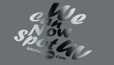
Be imaginative
When it comes to designing your print material, you can afford to think outside the box. The leaflets, flyer and posters we remember the most are ones that have done something different and not just followed a standard design. There’s no harm in testing out a few different designs and then seeing which ones work best. Ask your colleagues, friends, family and customers which ones they like and why. As long as you remember the aforementioned tips, your promotional material is guaranteed to make a lasting impression.
Keep up to date with current trend and new design tips
http://www.creativebloq.com/advice
http://www.howdesign.com/how-design-blog/
Feeling inspired? Head over to our online print shop to get started!