RGB vs CMYK
As a designer it is paramount you understand the difference between RGB vs CMYK and other colours for print. In short RGB should always be used for any artwork in the digital domain, CMYK should always be used if the artwork is going to print.
What is RGB?
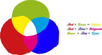
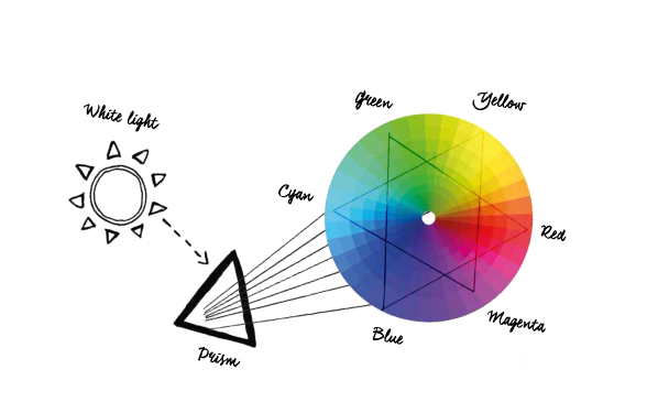
RGB – Red, green and blue is an additive colour method in fact the first method used to produce a colour range. In the visible light spectrum the three primary colours are red, green and blue. These are the three colours used by your computer monitor and is how your artwork is displayed on screen. These colours can only be viewed with natural light or emitted light from your monitor, and not printed on paper. Combining or adding one of these colours with another creates secondary colours, cyan, magenta and yellow. Adding all of the RGB colours produces white.
What is CMYK?
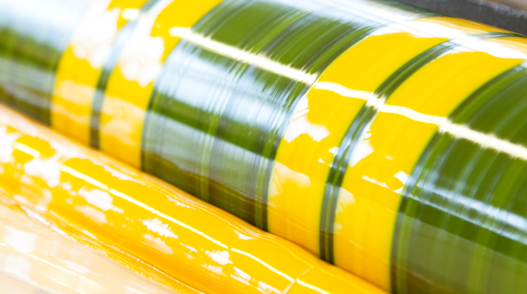
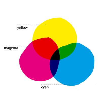
CMYK is a subtractive colour mixing method, subtractive colour mixing is the type of mixing you get if you light coloured filters from behind with a white light. When the colours are overlapped light is subtracted, if all the colours overlap black is produced. In the print process black “Key” is added, this is because when all the ink colours are added together they actually produce a dark drown and not a black. CMYK is the colour mixing method used for print, all documents should be set to CMYK and 300dpi. This is the standard print colour model and because four colours are used it is often called 4 colour printing.
Print Gamuts And The Visible Colour Spectrum
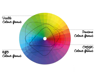
The best way to visualise the colour difference between CMYK vs. RGB is to look at colour gamut, or range comparison chart. This chart plots the visible colour spectrum, showing where in some cases the RGB colour space is outside the CMYK space. It is these colours that will be affected by the conversion from RGB to CMYK.
Pantone / Spot Colours For Print
When a brighter or more dense colour that cannot be achieved using the CMYK process is required, a Pantone colour can be used either as a fifth colour, on its own, or with other Pantone colours. An example would be a bright orange. This cannot be achieved using the CMYK process mix, so Pantone 021 Orange may be used. Shown below is a screen representation of Pantone 021 Orange and the nearest CMYK equivalent.
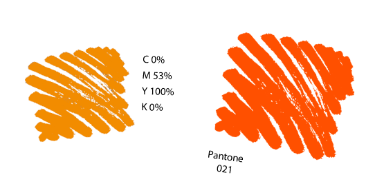
As you can see from the image below there is a big difference in the quality of Pantone spot colours for print and the same colour made up from the CMYK 4 colour process.
Colour Matching Systems
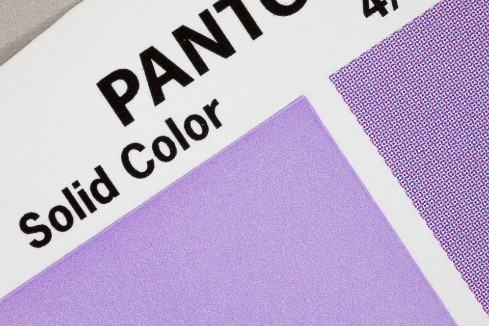
Colour matching systems (CMS) enables colours to remain as consistent as possible across jobs, as pre-mixed inks are specifically identified and catalogued so that any device or range of technology will produce the same colour outcome. The most popular CMS is the Pantone Matching System (PMS), which is used for specifying extra colours to sit along CMYK in the required colour spectrum. Most of the 1000+ Pantone spot colours cannot be created with CMYK base colours, but can be formed with 13 base pigments (14 if you include black) which are mixed in formulaic amounts. Metallics and fluorescents are also created through the PMS.
Pantone colours are identified by an allocated number and swatches of the required Pantones will provide you with a printed example of what a colour will look like on paper. These swatches can then be shared with those involved, across clients, designers, account teams and printers, to ensure consistency in colour use and guaranteed results across the board. Each Pantone number is followed by the letter C or U, and this refers to the type of paper. C is for ‘coated’ and U is for ‘uncoated’. The letter M, if seen, represents the word ‘matte’ which is, technically speaking, a coated stock. ‘Coated’ in the printing world will refer to a gloss finish; however, paper and stock will be covered as a topic in more detail in our guide to paper.
Colour Separation
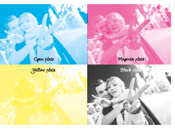
Colour separation is the act of decomposing a colour graphic or photo into single-colour layers. For example, to print full-colour photos with an offset printing press or digital press, the photo must first be separated into the four basic ink colours. Each single-colour layer is then printed separately, one on top of the other, to give the impression of infinite colours. This type of colour separation, mixing three or four colours to produce an infinite variety of colours, is called process colour separation. Another type of colour separation, called spot colour separation, is used to separate colours that are not to be mixed. In this case, each spot colour is represented by its own ink, which is specially mixed. Spot colours are effective for highlighting text, but they cannot be used to reproduce full-colour images.

When to use 4 5 7 10 Colours For Print
4 Colour CMYK
Most of the gamut of colours are reproduced with these four ink colours. Process colour separation mixes three or four colours to produce a variety of colours.
When?
4-colour printing is principally used for graphics and in commercial printing for the reproduction of colour images and text.
5 Colours
The gamut of colours used naturally expands when adding an additional spot colour to the 4-colour printing process. The fifth colour could be unmixable Pantone metallic or fluorescent to produce a desired effect on the finish, or it could be a varnish or coating. 5-colour printing could also reference the use of five spot colours.
When?
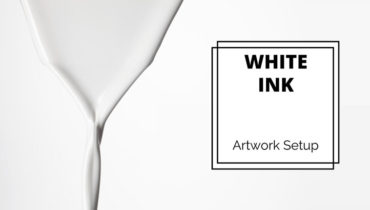
5-colour printing should be used where a vibrant spot colour is needed in addition to the reproduction of an image, such as with a logo or in a document. To match 97 per cent of Pantones, and add vibrancy to colour or print on coloured stock in the case of white. For complex or high-volume printing jobs.
7 Colours
In 7-colour printing, CMYK is used with the addition of orange, violet and green (or white in the case of Brunelone’s 7-colour printing press) to match 97 per cent of Pantones.
When?
To match 97 per cent of Pantones, and add vibrancy to colour or print on coloured stock in the case of white. For complex or high-volume
printing jobs.
10 Colours
Handling high-volume print jobs in high definition, 10-colour printing, produces premium results on a range of materials from paper to carton. It is hugely precise, and due to the advancement in its technology, paper and ink wastage is reduced. It can print five colours on each side of paper and up to 15,000 sheets an hour.
When?
For complex or high-volume
printing jobs.