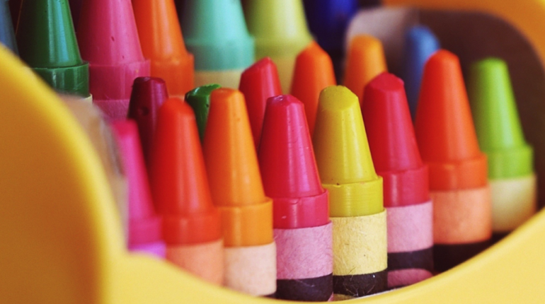
We may not realise it, but colour is a great psychological tool. Different colours convey different meanings and are used to evoke certain emotions from the people who view them.
Therefore, if used effectively you can hugely benefit from incorporating colour in your print material. In fact, a study from the University of Loyola revealed that colour increases brand recognition by up to 80%, while a separate study revealed that around 60% of the time, someone will decide whether they are attracted to a brand’s message based on colour alone.
It’s not just the presence of colour, but the combination of colours used. Selecting the correct mix of colours to represent your brand is key to reaching your target consumers. So, to help you out a little, here are some tips on using colour in your print material.
Select colours that best represent your brand
Colours are strong identifiers, so always choose ones that relate to your brand and/or services. If you are an insurance firm, for instance, it may not be a good idea to select bright pink for the background of your flyers.
Different colours have different connotations; here are a few examples:
- White: purity, cleanliness, neutrality, creativity, safety
- Black: authority, power, intelligence, stability
- Red: excitement, love, anger, passion
- Yellow: optimism, warmth, happiness
You should familiarise yourself with these connotations and use them to your advantage. An insurance company may want to appear knowledgeable and authoritative and so may choose to incorporate black within the colour scheme, for instance.
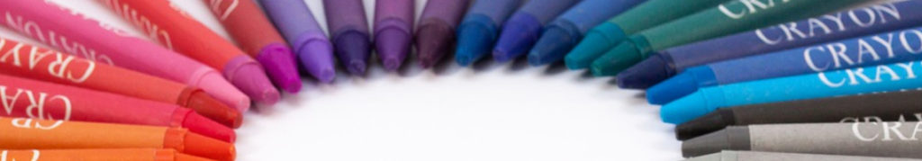
Combining colours
If you’re using more than one colour in your print material – which is most often the case – make sure you choose colours that complement one another. Familiarise yourself with basic colour theory, which uses a colour wheel to allow you to identify harmonious colour combinations.
You then need to decide how you want the colours to work together, i.e., what scheme you want to apply.
One option is applying a monochromatic scheme, where you use one solitary colour but in varying shades. Applying this scheme will create material that is clear, professional and soothing to the eye, though it may not stand-out or grab the attention of your target audience.
Or, you could opt for a complimentary colour scheme, where you employ a high contrast of colours by selecting shades opposite one another on the colour wheel. This will create a nice contrast and will be more eye-catching than using a monochromatic scheme.
Avoid colour clashes
Using the colour wheel and basic colour theory will help you to avoid making bad colour combinations, such as bright green against a red background. Bright colours are likely to make you stand out, but you don’t want to be standing out for the wrong reasons. As well as this, you should be careful when you use light coloured text on a darker background, as this can be overpowering, especially on print material.
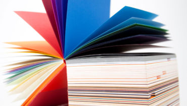
Consider the product
The colours – and number of colours – you use should depend on the type of promotional material, be it a business card, leaflet or brochure. Although it’s a good idea to be consistent with your colour scheme, smaller print materials may require less colours than larger ones.
Bear in mind that white space is very pleasing to the eye, so try to incorporate a little bit of it on all print material.
Test it
Never finalise a design without printing it out and testing it on all your chosen print material. The colours you choose will look completely different on screen than they will in your hand, so always print a small sample to see if it works.