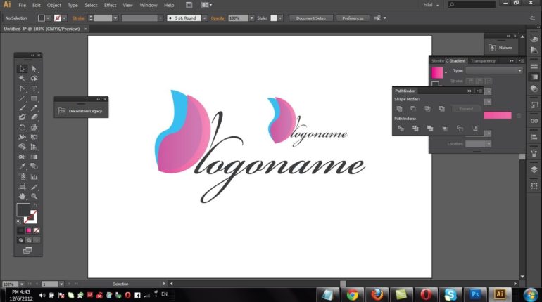
No matter what industry you work in, you should never overlook the importance of creating a good company logo. Your logo is a visual representation of your company and its values; it should be inviting, graphic and professional, and at the same time it should be simplistic with a timeless appeal.
One thing to remember is that your logo should be easy to translate onto different mediums and materials. You should consider where your logo will be displayed, for example on your website, business cards, leaflets, on promotion products, or in magazines. For print products, your logo will be the first thing a prospective client will look at and could largely influence their decision to use your services.
With this in mind, below are some tips for creating a good company logo for print products.
Research
Before you start designing, research your competitors’ logos. What are they like? What works well and what doesn’t? Which ones grab your attention and why? When analysing a logo, focus on the font type, the colours used and any images.

Consider your brand values
What works for a competitor may not work for you, as your company’s values could be completely different. Ask yourself what you want the logo to represent. Consider your target audience and think about what you want to communicate to them. There’s no harm in carrying out some market research by asking your clients what they expect from a logo, and what their views are of your business.
Colour
Let colour reflect your brand’s personality. A range of bright colours may be eye-catching, but it could look overwhelming sprawled across your company brochure. Greys and blacks may be a sophisticated scheme, but when your company is vying for new clients, it may be overlooked. What you need therefore is a balance, bearing in mind that you should never use more than three colours for your logo.
Different colours also have different connotations. For example, green is typically associated with nature and growth, yellow is associated with optimism and inventiveness, and purple is associated with spirituality and evocation. You can use this to your advantage – if your company sells organic products, for instance, you should incorporate green in your logo.
Typeface
One thing you’ll need to decide is whether you want your logo to incorporate your brand’s name, which is the case for most companies (think FedEx and Google). Sometimes, a company can be visualised by a standalone image, like Apple and Puma. If you want your logo to include text, the typeface is just as important as colour and will establish your brand’s tone.
A children’s toy brand may want to use an informal bubble text, whereas a financial services firm may opt for something more professional. Once you’ve decided on your typeface, you’ll need to consider whether you want the text to have colour, whether you want it to be bold or italicised, and whether you want it to be upper or lowercase, or a mix of both.

The design
If you want to use an image, make sure it is an original and designed specifically for your company. Always avoid clipart, as this will make your logo susceptible to duplication and may make it look unprofessional.
If you can, hire a graphic designer to help you with the process. They will have a clear idea about what already works, and will understand exactly how to create a fully-functional logo.
Test
The best way to see if your logo has the desired effect is to test it out. Print off a small sample of a range of your print products and hand them to your customers, family and friends. Get them to evaluate the logo, ask them the same questions that you asked yourself when researching competitors. If you receive mostly positive feedback, you’re nearly there; if not, it’s back to the sketch pad.


